005
Jamison Stamps & Books:
Philately Done Right
Jamison Stamps & Books is a purpose-built static website designed to support a real collecting and bookselling operation—one where accuracy, clarity, and long-term usability matter more than trends. The project reflects a deliberate design philosophy: keep the structure clean, the code readable, and the experience trustworthy.
This is philately done right, translated into the language of the web.
Intentional from the Ground Up
From the beginning, this project was guided by a single principle: build something that will still make sense years from now. That decision shaped every technical and design choice that followed.
Rather than relying on heavy frameworks or elaborate build systems, the site is built with static HTML, CSS, and light JavaScript. This keeps deployment simple, performance fast, and maintenance realistic. The result is a site that can be hosted anywhere, understood by anyone, and updated without ceremony.
In other words, it’s designed to last.
Structure That Respects the Content
The information architecture favors clarity over cleverness. Pages are organized logically—home, informational content, supporting materials—each written with semantic HTML that clearly communicates intent.
There’s no abstraction layer obscuring how things work. You can open any file and immediately understand the structure, the content flow, and how the page is assembled. This transparency makes the project approachable for future maintainers and reinforces the idea that good structure is a form of documentation.
Visual Design: Calm, Readable, Trustworthy
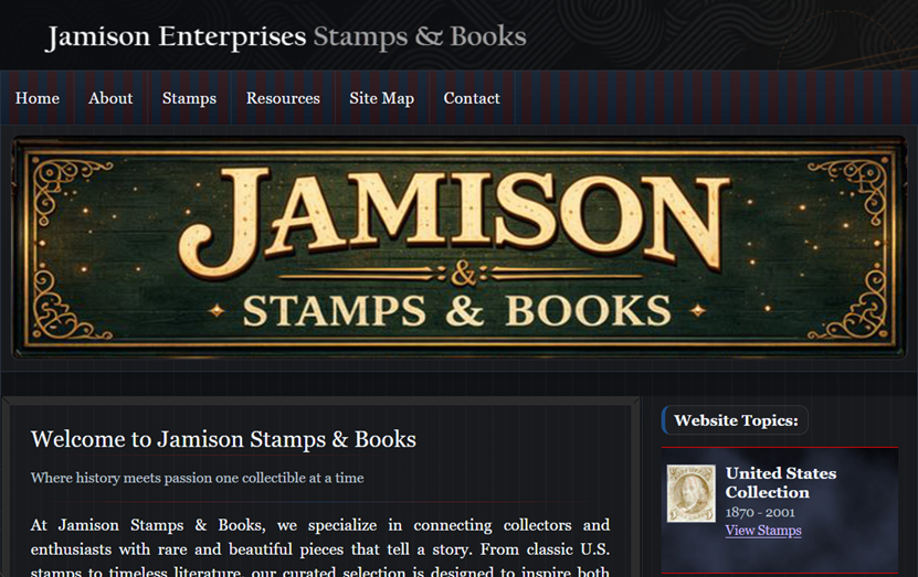
The visual design is intentionally restrained. Typography is readable and consistent. Spacing is generous. Color choices are neutral and unobtrusive, allowing the subject matter—stamps, books, and reference material—to take center stage.
CSS is organized for human comprehension rather than compression. Rules are grouped logically, selectors are clear, and responsiveness is handled through targeted media queries instead of dramatic layout shifts. The site adapts smoothly across devices while maintaining a consistent visual identity.
This isn’t a design that tries to impress. It’s a design that tries to reassure.
JavaScript as a Supporting Actor
JavaScript is used sparingly and with purpose. jQuery supports pagination and small usability enhancements, improving navigation through larger content sets without introducing unnecessary complexity.
There’s no over-engineering here. No sprawling client-side logic. Each script does one job, does it predictably, and then gets out of the way. This keeps the site accessible, performant, and easy to debug—qualities that matter far more than novelty in real-world applications.
Built for Maintenance, Not Just Launch
One of the most practical aspects of this project is how clearly it anticipates ongoing maintenance.
The directory structure is intuitive. Assets are organized sensibly. Supporting documentation and reference materials make it easier for someone else—developer or not—to update content without fear of breaking the site.
That’s not accidental. In real environments, websites are often maintained by people who didn’t build them. This project respects that reality and designs for it.
Supporting Materials and Real-World Context
Beyond the core pages, the project includes supplementary assets such as print-ready materials, reference files, and layout samples. These elements reflect how the site fits into a broader workflow that extends beyond the browser.
It’s a reminder that real websites support real activities. They don’t exist in isolation—they serve collections, businesses, and people.
Performance and Longevity
By keeping dependencies minimal and avoiding heavy client-side rendering, the site loads quickly and behaves consistently across browsers. There’s no fragile toolchain to maintain and no dependency on external services just to keep the lights on.
This is a site designed to age gracefully—stable, predictable, and resistant to unnecessary breakage as technologies evolve.
Why This Project Matters
Jamison Stamps & Books isn’t flashy, and it doesn’t try to be. That restraint is the point.
For employers and recruiters, this project demonstrates judgment: knowing when simplicity is the stronger choice. For developers, it highlights a solid grasp of fundamentals—HTML, CSS, and JavaScript—applied with intention and discipline.
It shows that professionalism often looks quiet, not loud.
Frank's Final Thoughts
This project reflects a philosophy that carries through all of my work: build for humans first, maintainers second, and trends last.
Jamison Stamps & Books is a site designed to be trusted, understood, and maintained over time. It does exactly what it needs to do—no more, no less—and does it well.
That’s not an accident. That’s the craft.
